Material Design 按鈕介紹
BY Grace │


關於Material Design 的按鈕(Button) 其實也是有一套準則在內,今天就整理其種類與尺寸規範給大家參考
Button種類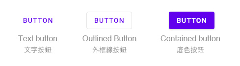
1.Text button (明顯度最低) :通常用在對話框、卡片裡,使用文字按鈕好處是在卡片或對話框裡,因為無獨立的外框區隔,降低注意力,使得閱讀其他內容注意力不會被分散。
2.Outlined Button (明顯度中等):由外框線與文字組成。
3.Contained button (明顯度最高):按鈕搭配純色底色,通常做元素內重要按鈕使用,有搭配陰影使用會因為按鈕的重要度影響陰影的高度,如果按鈕加上圖標,文字與圖標不能垂直排列。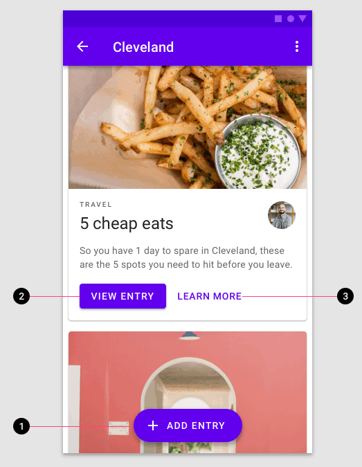
Button使用尺寸規範
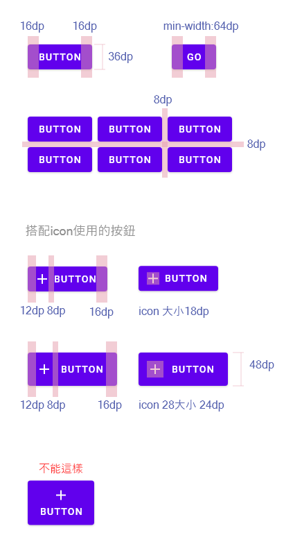
按鈕,最小寬度64dp,高度36dp,上下左右外距8dp,左右內距16dp。
Button種類
1.Text button (明顯度最低) :通常用在對話框、卡片裡,使用文字按鈕好處是在卡片或對話框裡,因為無獨立的外框區隔,降低注意力,使得閱讀其他內容注意力不會被分散。
| 卡片內純文字的按鈕,較不易分散閱讀卡片內容的注意力 |
2.Outlined Button (明顯度中等):由外框線與文字組成。
3.Contained button (明顯度最高):按鈕搭配純色底色,通常做元素內重要按鈕使用,有搭配陰影使用會因為按鈕的重要度影響陰影的高度,如果按鈕加上圖標,文字與圖標不能垂直排列。
| 按鈕可能同時存在但會有其重要性區分,1最為重要其高度也越高,陰影越大 |
Button使用尺寸規範
按鈕,最小寬度64dp,高度36dp,上下左右外距8dp,左右內距16dp。


台灣近年的認證的情況")


